
SaveMe
SaveMe is an app created to offer support, education, advice, and a voice to people who have experienced sexual misconduct, as well as to those who support them.
Overview
Project: Diary Entry Feature / Stories
Product Type: Mobile App
My Role: UX/Product Designer
Team: Product manager, 2 developers, 2 UX Designers
Timeline: 6 weeks (from discovery to design iteration)
Goal
Increase the number of visitors and subscribers to establish the app as a safe and trusted space where users can find support.
Note: To simplify the explanation and reduce potential stress from the term “victims of sexual misconduct”, they will be referred to as VSM throughout this document to minimise the impact of the wording and maintain focus on the case study.
The Challenge
The app became a place where individuals and their supporters could access valuable support and educational resources. However, there were not enough subscribers to sustain its growth and reach. Initial support came from private clinics and centres, but low visitor numbers affected their continued support, which was essential for the app’s operation and maintaining contact with real users (victim-survivors and supporters).
Discovery | Research
Methods:
User interviews (subscribers)
Interviews with VSM patients and supporters from selected clinics (to reach the target number of interviews)
Review of in-app behaviour analytics
Analysis of customer support feedback
Desktop research to understand engagement on other platforms
Note: Recruiting participants for the app’s research was always challenging, particularly when trying to reach users (VSM and supporters). This time was no exception, and we pivoted to interviewing clinic patients who were not subscribers and had never visited the app.
Key insights:
People want a space where they can find others with similar challenges and struggles.
People want to fill supported and not judged
Anonymity mattered, but trust mattered more.
“Users wanted visibility without vulnerability”
Discovery | Define
Problem Statement:
How might we create a safe space that encourages users to engage with and subscribe to the app, while giving them control over their visibility and ensuring they feel secure?
Design | Ideation
With the key insights gathered and the problem statement defined, we began exploring ideas related to:
Public community wall
Profile-based experience sharing
A personal diary feature
With these ideas in mind, and after several rounds of ideation, the team developed a personal diary feature where we prioritised:
Clear privacy explanations
Visibility control at the point of publishing entries, comments, and/or reactions
How to encourage participation and subscriptions
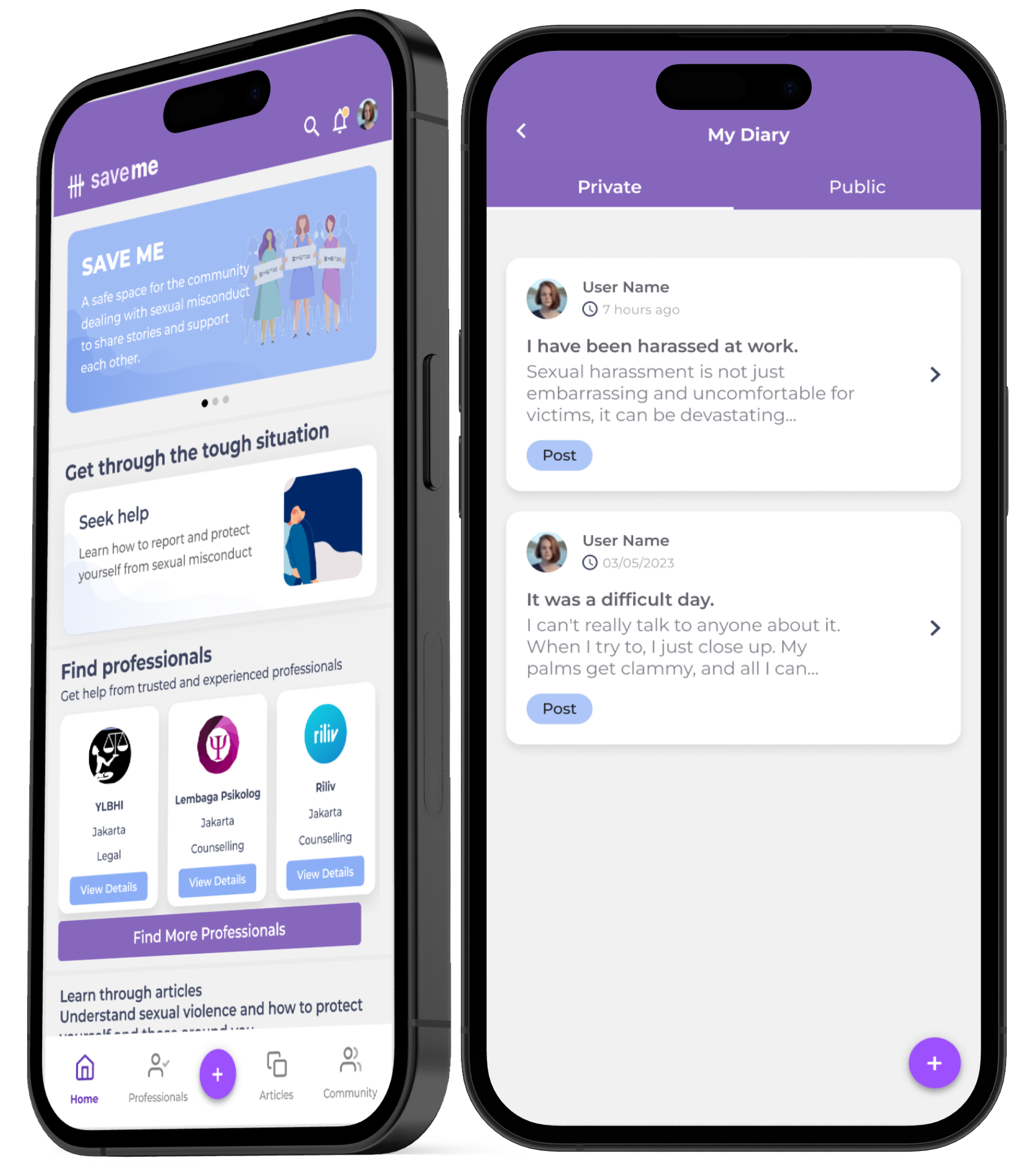
The Solution
We created a feature where users need to subscribe to create their own diary, with the option to keep their entries private or make them public. Entries can also be shared in a new section called Stories, either anonymously or under a chosen display name.
To encourage visitors to become subscribers, they can only read diary entries and comments to understand the value and impact of the feature, with all participant details displayed anonymously.
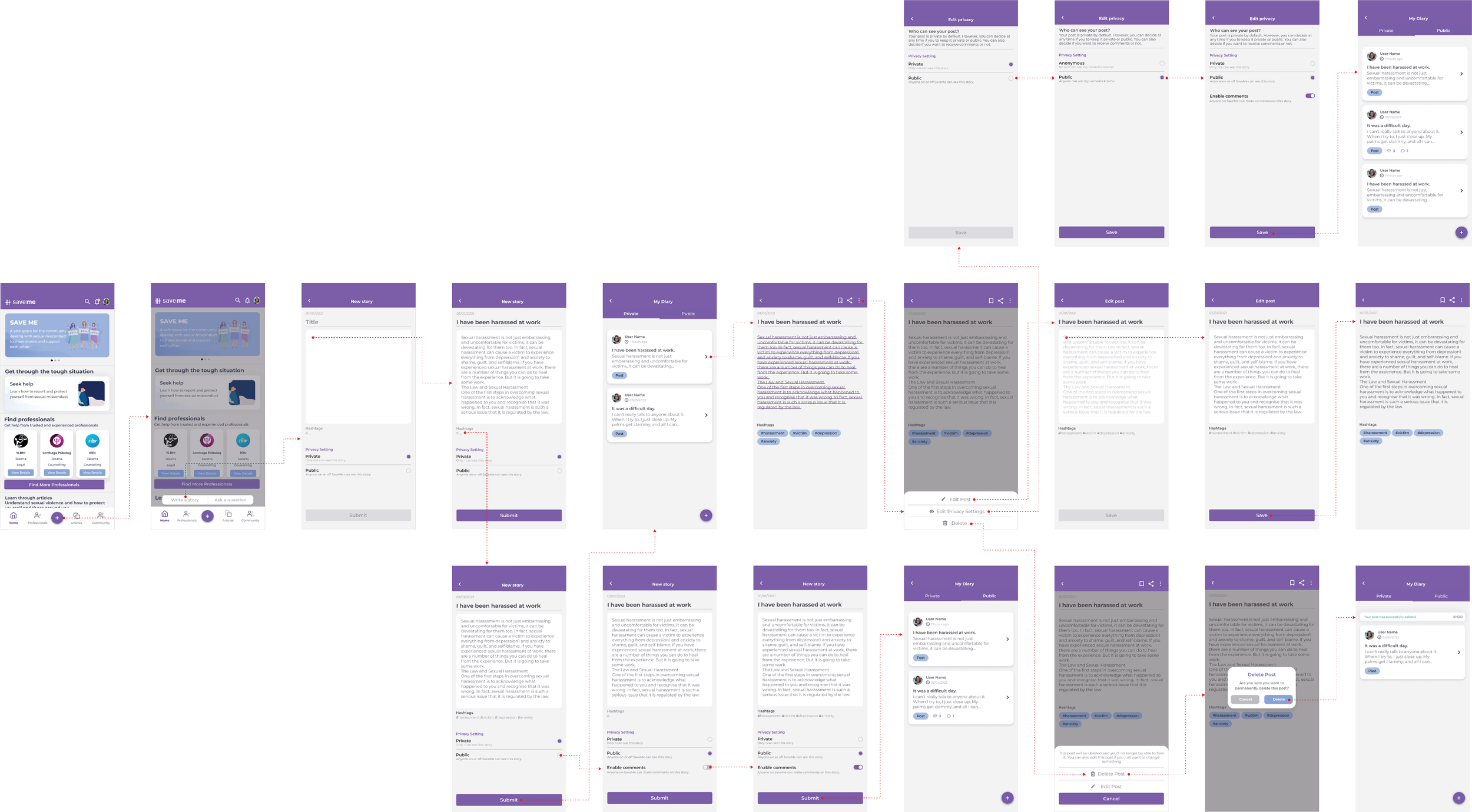
Design | Develop & Testing
We discussed as a team the possible scenarios users could face when creating a diary entry, which helped us develop the user flow. Once we agreed on the flow, we created a high-fidelity mock-up (image below), which enabled us to conduct usability testing with current and potential users.
Prototype
Note: As I no longer have access to the live file, I am presenting a prototype with screens that represent most of those used in the high-fidelity design created for the Diary Entry feature.
What We Learned
Overall, the usability testing results for the diary entry feature were positive. We also received a common suggestion to include a discussion board where users could ask questions related to the topic. However, not all the feedback was positive. Users did not fully understand what “anonymous” meant in terms of data and privacy, or how safe their interactions would be. They expressed concerns about:
Being identified
Potential legal consequences
Data misuse
Iteration:
Based on the negative comments and concerns from users, we went back for another round of ideation and, after further discussions, decided to introduce:
A clear onboarding message explaining privacy protections
Microcopy reinforcing anonymity at the point of publishing
A confirmation step before publishing
Impact
Within:
1 week, subscriber numbers increased by 25%
1 month, diary entries increased by 65% compared to the first week
1 month, subscriber numbers increased by 40%
Additional impact:
The feature became the most used by subscribed users
Increased average in-app time for subscribers and visitors
Positive qualitative feedback from users feeling “heard” and “safe”
Personal Reflection
Understand how to pivot user research to collect the right information
Iteration before launch is critical in sensitive-product environments
Privacy isn’t just a feature; it is a perception